Redesigning a Public Sector Intranet and Employee Experience
Using human-centred design to streamline internal portal usage for thousands of public service workers.
Using human-centred design to streamline internal portal usage for thousands of public service workers.
Outwitly is a long-term strategic partner to several federal government departments, supporting UX design, HCD and design research initiatives year after year. As the public sector continued shifting toward more digital and online services for Canadians, government employees also needed the tools, guidance, and UX design capacity to transform how they worked internally.
In 2018–19, Outwitly partnered with one of these departments to help them redesign their intranet web portal. The goal was to better understand employee frustrations and inefficiencies, identify which digital tools were helping or hindering day-to-day work, and transform the intranet into a centralized solution that was more discoverable, shareable, and adoptable for staff across the organization.
I will always give Outwitly 5 gold stars. I have enjoyed working with their UX team and appreciate their thoughtfulness and attention to detail. I can’t wait to work with them again!
Senior IT Professional, Federal Crown Corporation
Employees across the department were struggling with inefficient workflows, disconnected systems, and a lack of clear digital standards.
Key challenges included:
An overwhelming number of tools and intranet sites. A department of 5,000 full-time and part-time employees was regularly using eight separate intranet sites, alongside additional software tools, to complete everyday tasks.
Low efficiency and high frustration for staff and managers. Employees were expected to navigate multiple platforms without proper training, leading to frustration, duplicated effort, and inconsistent ways of working.
No shared standards for digital collaboration. The absence of best practices for saving, sharing, and storing documents made information difficult to find and manage, slowing work across teams.
Increased strain on IT support teams. Confusing navigation, inconsistent structures, and overlapping systems generated frequent service requests, limiting IT’s ability to focus on other strategic priorities.
Outwitly’s seasoned UX design and research team first focused on understanding how employees actually worked day to day, and then on translating those insights into solutioning for a more coherent and usable intranet experience.
The work focused on:
Grounding the redesign in real employee needs. We launched a department-wide digital survey and conducted in-depth interviews with 16 employees across a range of teams and seniority levels to understand daily workflows, frustrations, and priorities. Participants were intentionally selected to represent the breadth of roles and use cases across the department, ensuring the research captured recurring patterns rather than isolated perspectives.
Building shared understanding and momentum through co-creation. Three half-day “design jam” workshops brought employees and stakeholders together to build excitement around the project, surface key challenges with existing intranet sites, and apply design-thinking principles to explore solutions collaboratively.
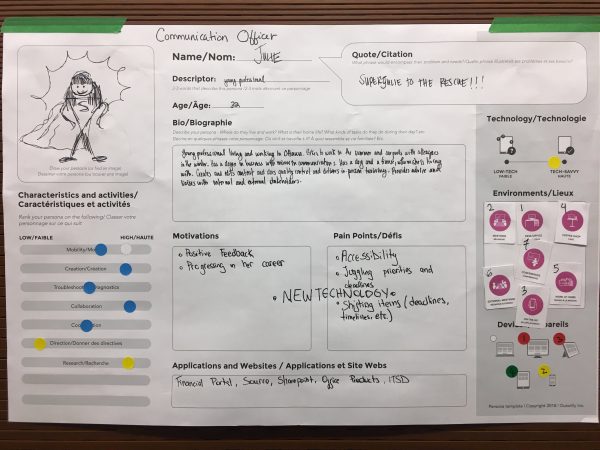
Clarifying user needs through personas and journey mapping. Together with participants, we created a set of user personas representing the department’s varied roles and mapped employee journeys to visualize workflows, identify gaps, and clearly highlight strategic opportunities for improvement.

Translating research into solid design direction. Insights were captured in a clear, accessible insights report that wove smartly designed visuals into a compelling overall story — making the research findings and recommended intranet guidelines easy for stakeholders to understand and the product team to act on, and connecting them directly to the organization’s goals around efficiency and ease of use. These insights directly informed the UX design and the implemented overhaul of the intranet experience.
Designing a cohesive, task-focused platform. The redesign consolidated multiple intranet sites into one cohesive platform tailored to each user persona. This included improving search functionality, redesigning information architecture and navigation to be more task-based, and creating storyboards, page layouts, and wireframes for more than 25 key screens and numerous additional features.
The outcome of the engagement was a complete redesign and consolidation of the department’s intranet — replacing a fragmented system of tools with a single, coherent platform employees could rely on to do their work.
The new intranet service:
Replaced fragmentation with a centralized platform. What had previously required employees to navigate eight intranet sites and additional tools was brought together into one task-focused intranet, making it significantly easier to find information, complete work, and collaborate across teams.
Improved employee efficiency and day-to-day experience. Staff gained clearer, more consistent access to the tools, documents, and information they needed, reducing friction, confusion, and time spent searching across systems.
Enabled easier adoption while reducing reliance on IT support. Clear navigation, task-based structure, and familiar patterns made the new intranet easier for employees to use with less reliance on guidance or troubleshooting, easing the burden on IT teams and enabling them to re-focus on other service priorities.
Enabled more sustainable evolution of the intranet over time. Recognizing that technology, services, and employee needs may evolve, the redesigned intranet established a clear, cohesive structure to which future updates could be more easily made if needed. Shared standards, clearer information architecture, and a unified platform reduced the risk of reintroducing fragmentation or complexity over time.


We’re ready when you are.