About
Outdated and cumbersome government portals do a disservice to citizens, particularly for those seeking aid and financial support. As government increasingly moves toward digital operations, websites and online services must be replaced with efficient and user-friendly tools and applications for public access.
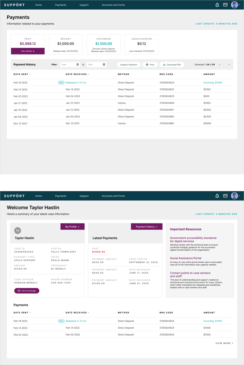
Outwitly was engaged over 10 months to improve the customer experience of an online government service for citizens seeking child or spousal support, provide recommendations for its reinvention, and lead its complete redesign. Our task was to reduce manual processes with automated/efficient systems, reduce call volume, improve case load, and improve user experience by providing meaningful case information to citizens in an easy-to-access and modern online portal.
I showed the app Outwitly created to our Deputy Minister… She was thrilled with how nice it looked and the simple layout of information. She is excited for how useful the clients will find the new service.
Executive Director, Provincial Government Department
The Challenge
The online portal for this service, which serves over 30,000 citizens, was extremely outdated and clunky, and users were frequently unable to access very basic details and information about their own case. This led to a high volume of unnecessary calls to case workers and staff, which in turn prevented staff from having the time to manage their more difficult cases. As a result, fewer payments and transactions were being made to citizens in general.
The Goal
Gain a deeper understanding of the needs and motivations of the citizens and case workers, as well as their workflows and processes, in order to offer innovative feature ideas and design a new online minimum viable service (MVS).
The Process
We began by holding a full-day discovery workshop with stakeholders and key staff to better understand the current state and develop a collaborative vision for the future. Several days of onsite contextual observations and 35+ in-depth interviews were conducted with staff and citizens. We developed journey maps, an ecosystem map, two Insights reports, and a 5-Step Action Plan, all of which identified requirements for an improved online service and insights for how to better on-board citizens and improve their experience.
The Research
35+
In-Depth Interviews
with citizens and case workers
3
Days of Observation
with front-line case workers
16
Usability Test Sessions
were conducted with real users
Many citizens using this service are socio-economically disadvantaged, and missing even one payment could seriously upset their livelihoods. Our research revealed that there were also important legal elements to the service that were not clearly explained to citizens, or that were hard to understand in general. This lack of understanding and support created an emotional and stressful environment for many citizens, which often translated into repeated and sometimes heated calls to case workers and staff. An easy-to-use online portal where users could easily view all of this information was urgently needed.
These important insights were used to inform the user experience (UX) design of the online service. Outwitly used an iterative, agile approach to design the desktop and mobile experiences–– moving from low-fidelity wireframes and concepts to high-fidelity visual design by conducting usability testing with real clients using clickable prototypes. Outwitly worked closely with the technical team to ensure the smooth implementation of the MVS and to ensure government accessibility standards for digital services were upheld. Our team also provided continual strategic guidance for the successful digital transformation of the organization.
The Impact
Citizen adoption of the new online portal has continued to grow with each passing month, with over 2,500 citizens now successfully onboarded.
Approximately 75% of users are accessing the service on their mobile device––an incredible transformation that has allowed citizens to more conveniently manage and view their personal case information.
This government department also reported that the new system has allowed them to dramatically increase service levels to citizens by reducing the volume of calls and contact points to case workers and staff. This has positively impacted their entire unit, empowering staff to do their work much more effectively, with more time to manage more serious cases and issues.

