Conducting design research is a whole lot of hard work! From setting your project up for success, thoroughly planning out the research you’ll conduct, and talking with real users through in-depth interviews, observations, and diary studies, rest assured you’ll be kept busy. However, when your research is all wrapped up and it’s time to dig into what you’ve learned, you need to know how to properly analyze the data. Without data analysis know-how and an understanding of the process, unfortunately, all that hard work could be for nothing…
… But you know we won’t let that happen to you!
In today’s blog post, we’ll cover…
- What is data analysis and why is it important?
- The process of making sense of data
- Three methods for analyzing data
- Three tips for analyzing data
What is data analysis and why is it important?
“Data analysis is the process of collecting, modelling, and analyzing data to extract insights that support decision-making” –DataPine. The methods and techniques used for data analysis will vary depending on whether the data collected is qualitative, like the aforementioned in-depth interviews, diary studies, and observations, or quantitative (think, analytics!) Research goals play a critical role in the data analysis process. If you were to analyze research data, but you didn’t have research goals or research questions set beforehand, you might be drawing unhelpful or inaccurate conclusions. In the case of UX and design research, the research we’re conducting is very practical. We’re doing research to improve something that exists or create something new based on the research goals we set out earlier on. This becomes especially crucial when we set out to synthesize the data – we’re making sense of it based on what our research goals were in hopes to draw meaningful conclusions that will inform the product or design. We’ll dive into data synthesis in more detail another time!
Data analysis allows you to decode relationships and patterns in data in order to reveal meaningful insights, draw conclusions, and lead stakeholders toward informed decision-making! If you were to conduct qualitative research but not go through the process of data analysis (and synthesis) afterward, you actually aren’t making decisions on the foundation of sound information. A lot of what you’ve “uncovered” might be based on your memory of those interviews or from brief notes you took along the way. This is the difference between conducting design research properly and doing it improperly. Following rigorous data analysis methods allows stakeholders to make informed decisions based on the data you’ve uncovered. Without rigour, you can’t be totally sure that you’re making the right decision for your next product or feature launch. Data analysis and synthesis allow you to have confidence in your insights and the decisions they inspire – the ultimate goal!
The process of making sense of data
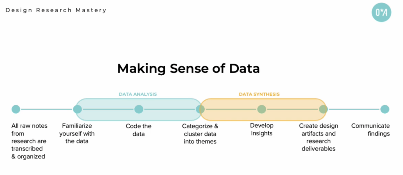
Making sense of data involves data analysis (which is the process of finding repeating patterns in the data) and data synthesis (the process of creating insights based on the repeating patterns). We created this diagram to show the end-to-end process of sense making:

Ultimately, you can break the process into seven steps:
- All raw notes from research are transcribed and organized
- Familiarize yourself with data
- Code the data
- Categorize and cluster data into themes
- Develop insights
- Create design artifacts and research deliverables
- Communicate findings
The blog would be too long if we explained each step in detail, but if you want to know more about how to make sense of data, check out our course, Design Research Mastery. It’s such an important piece of the design research process that we dedicated an entire module to it!
For now, and perhaps most importantly, you’ll need to understand steps 3 and 4 of the process above. In step 3, coding data involves identifying “codes” or tags to represent ideas that are emerging from the data. For example, if you’ve conducted in-depth interviews with users and had those interviews transcribed, you could go through each transcript, line by line, and start to highlight different ideas that are appearing in the text. You might use colour coding to highlight ideas that repeat across different interviews (where different participants said similar things) or you could use codes – which you might name as “payment delays” when you hear people complaining about issues with their payments, or you may go one level higher with a code like “payments” and then (as part of step 4) group anything said about payments under that code. After grouping the snippets of text that are similar under codes, you might do another pass at the larger buckets of data and recode them. For example, within the larger code of “payments”, you might break it down to “payment delays”, “payment inaccurate”, or “payment fast”. Don’t be precious with the code names, just come up with something that sort of represents the idea. You will change them later when you develop your theme names!
Three methods for analyzing data
| Our favourite three ways to analyze data are…
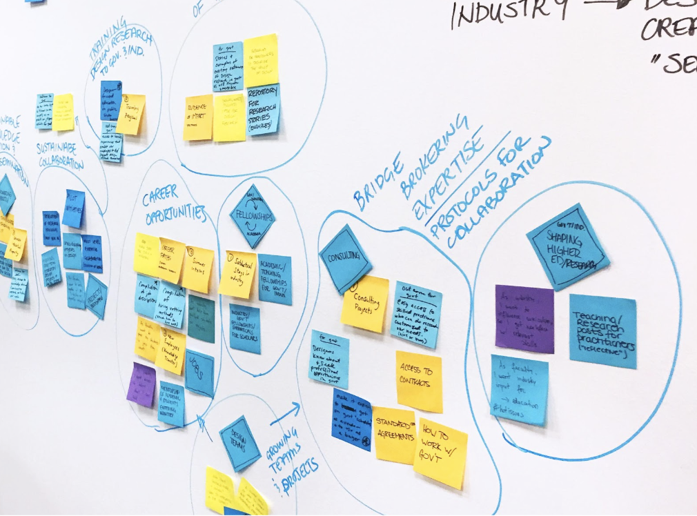
Affinity Mapping – This is where ideas are written down (or digitally recorded using a tool like Miro) on post-it notes and grouped based on their closeness and relationship to each other. You’ll want to stick to one idea per post-it note, and from there, you might regroup ideas and categorize them into higher-level themes! This collaborative exercise is best for a workshop-like setting including other team members and stakeholders. |
|
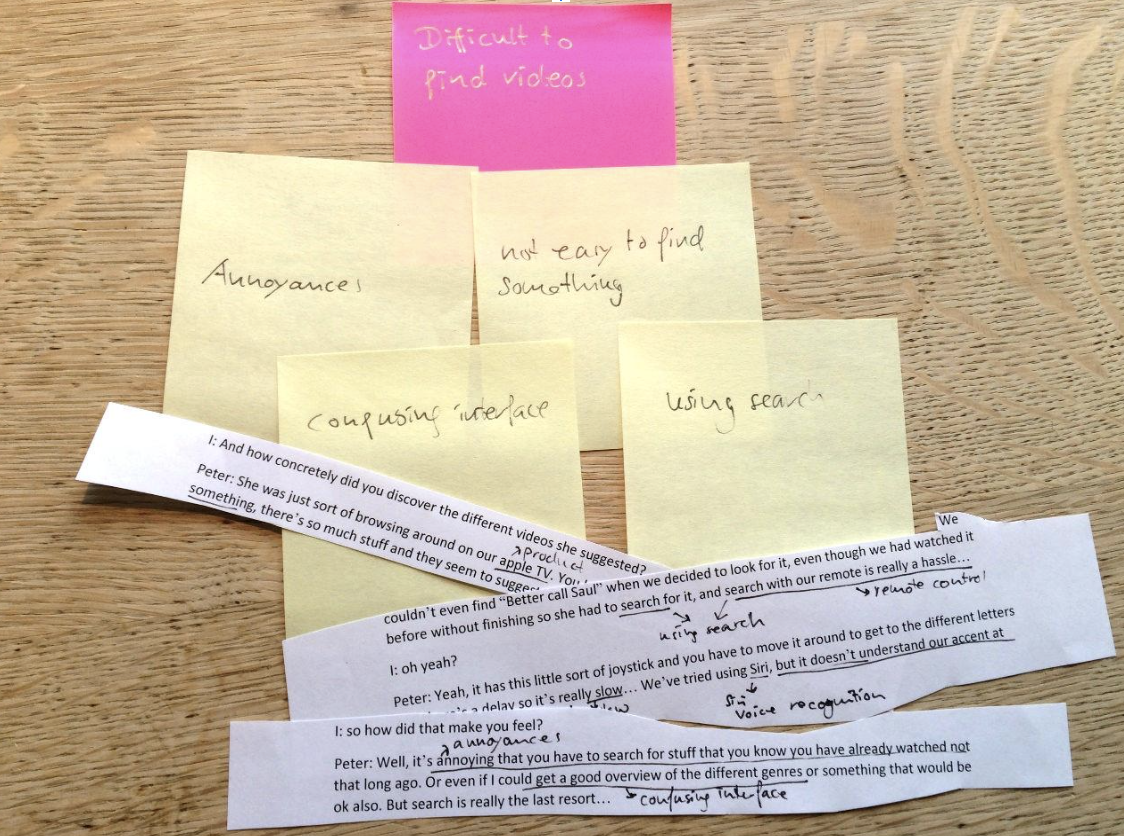
| Analog – Aka, the old school way! This is how data was analyzed before there was access to the many digital tools we know and love today. Analyzing data the analogue way means you’re doing it by hand without the use of any digital tools. Print your notes out and code the ideas using highlighters and pens, then cut the ideas out using scissors and glue them onto the board with other repeating ideas. Sure, it’s more time consuming, but this can be a nice switch up from staring at a computer screen. It’s quite satisfying to see all of your notes and patterns physically in front of you! |
|
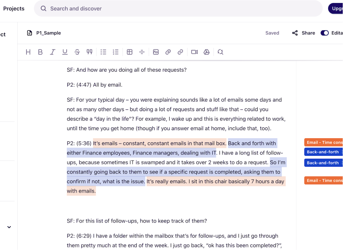
| Digital – This is the method we use most frequently here at Outwitly. In the digital method, data is analyzed using design research tools and applications like Dovetail, or you can use any digital software you have access to – Word, Excel, or Google Sheets will work just fine. This is a more efficient way of coding data that can be easily shared between team members and assist in distributing the workload. Remember, design work should never be done in isolation – the most brains involved, the better! |
|
Our best tips for analyzing data
From plenty of experience, we’ve accumulated a few top tips that will help you on your data analysis journey:
- Keep moving forward! As designers, we tend to err on the side of perfectionism (guilty as charged!) We totally sympathize with the feeling of needing to get everything right, but truth be told, that doesn’t always serve the greater picture. If you’re stuck on the name of a code, or if an idea you have seems too similar to an existing code, simply code it and move on. If you don’t check yourself on this, you risk having the data analysis process take forever. A bonus tip is to create an “unsure” code – come back to these undetermined points later on so you can maintain productivity. This brings us to our next tip…
- Iterate. Just like design, analyzing data in research is an iterative process. As you go, you’ll continuously refine your codes, merge redundant codes, and create and iterate on your main themes and high-level concepts. This is such an important part of the data analysis process. It’s very normal to go through and code your transcripts and be left with a bunch of things that you aren’t sure where they land/belong. You’ll go back to the “unsure” code and try to re-code those ones and discard the data that is unuseful or irrelevant.
- Stay organized. We like to say that analyzing data is a messy (and beautiful) process, so it’s important to remain structured. The best way to do this is to have a clear system for organizing codes and themes. This might be through a spreadsheet or word document! Always track which notes have been analyzed and which ones haven’t been yet. Again, a spreadsheet is the best way to do this. Each participant’s data should be labelled (P1, P2, P3, etc.) and organized accordingly.
Hopefully, this post helps you with data analysis in your next UX or design research project! We couldn’t squeeze all of our wisdom into this one blog, but if you’re looking to learn more, our course Design Research Mastery takes things to the next level! We dedicate an entire module and provide major detail on grounded theory, data synthesis, developing insights, tools and tech for data analysis, and so much more. Check it out here!


