

In Part One of our series on UX Testing we described the different types of user testing and prototyping. In Part Two, we dove into all things usability testing, including the differences between moderated and unmoderated testing, how to develop a test protocol, usability testing best practices, and our favourite remote tools! If you haven’t already read those posts, be sure to check them out.
Now, if you’ve landed here, it’s likely because you have conducted a few usability tests with actual users and are looking for new ways to analyze data and improve your reporting. We’ve got you covered!
In today’s post, we’re talking about:
- Three data points you don’t want to forget to collect,
- Our favourite ways to analyze data from a usability test, and
- Five tips to use for your next report.
Three Data Points to Collect During the Test
Before we get to data analysis methods, let’s take a moment to talk about some data points you should be looking to collect while conducting your test. In our last post, we discussed the importance of developing a test protocol that outlines all of the tasks you plan to ask participants to complete, with a set of probing questions and scenarios that would provide meaningful context to your participants. This is important to do because it will allow you to easily find patterns in the data and expedite your analysis and reporting. Because, through using a test protocol, you are keeping your findings organized!
In addition to writing your test protocol, you’ll want to note down the following three factors during the test. These will help you with your reporting!
-
Pass/Fail – Was the user able to complete the task without intervention from the moderator? Or did they get stuck, leaving them unable to complete the task (without asking for help?). Remember, it doesn’t actually matter if they pass or fail, as usability testing is all about learning and improving.
-
Time on Task – How long does it take the user to complete the task? This can be a useful metric to track, especially if you plan to do multiple rounds of usability testing (after you’ve made design improvements). If you’re able to reduce the time on task in follow-up rounds, that likely means you’ve made the experience more streamlined for the user!
-
Impact or Severity – How hard was the task for them to complete or how much did the task (and their ability to complete it) impact their experience with the rest of the app or website? (Check out the “Measured Experience” Analysis method below for more details!)
Finally, make sure you record your usability sessions! This is SO important for data analysis.
How to Analyze Results From a Usability Test
There are several different methods you can use to analyze the findings from your usability tests. How you analyze your data is important! Not only will these results impact the UX design of your application or website, but they will also likely be shared with team members and stakeholders. So, it’s important to accurately analyze the data and reflect your findings in a way that is clear and easy to understand for both your client and team.
We’ll walk through FOUR different analysis methods you can use to get started. While each of these can be used in isolation, we recommend using a mix of these methods for your data analysis. This will result in a richer understanding of the data.
1. Affinity Mapping
Affinity mapping is one of the most common ways of analyzing data in UX or design research! Affinity mapping is a very simple exercise developed from the principles of Grounded Theory (where you look to identify repeating ideas in the data and code them into themes). Usertesting.com has an excellent example of Affinity Mapping, and you can check it out here!
Affinity mapping is easy! We’ve broken it down into four steps for you:
-
Write each idea or issue that arises in the usability tests on a separate post-it note (one idea per post-it!)
-
Group similar ideas together. Look for themes and patterns in the data and create clusters of sticky notes that are similar to each other.
-
Name each grouping. Discuss the groupings with your team and make adjustments as needed.
-
Summarize each grouping and describe the high-level ideas or issues that emerged per theme/group. These will become “areas of improvement” in your report and will inform your design recommendations.
2. Rainbow Method
The Rainbow Method uses a colourful spreadsheet to visually represent how many participants experienced similar issues. The Rainbow Method is a great way to take a glance at how many people experience the same issues during the usability tests. If you have a complete rainbow, then that is likely an area that needs design improvement.
While this method is easy to use, it should not be used in isolation. You should only use the Rainbow Method as a supplement to other methods (such as affinity mapping!) as there are no places for quotes or individual participant notes and no severity level shown.
To use the Rainbow Method method, reference the example below and follow these steps:
-
In the first column of a spreadsheet, list out each idea, issue, and suggestion that arises during the usability tests.
-
Across the top, list out the participant numbers.
-
Pick a colour to represent each participant (think red, orange, yellow, green, blue, purple, pink… the colours of the rainbow!)
-
Then, as you review the recordings, each time a participant experiences an issue, colour their cell. This will create that rainbow effect.

Image Credit: https://uxdesign.cc/the-rainbow-sheet-a-visual-method-for-research-analysis-a7e7d2011058
3. Task Completion
The Task Completion method records the difficulty level for each task performed by a participant in a spreadsheet, making it easy to see at a glance which tasks were the most difficult. Similar to the Rainbow Method, for best results, you’ll want to use this analysis method in conjunction with other methods! Task Completion alone won’t provide additional context about what your users were experiencing and why they were struggling and there is no place to include user quotes or suggestions.

Image Credit: https://www.userbrain.com/blog/7-step-guide-guerrilla-usability-testing-diy-usability-testing-method
4. Measured Experience
The Measured Experience analysis method uses formulas to assign a severity score to issues. This method is excellent because concrete numbers bring confidence to stakeholders. Measured Experience uses colour coding (as shown in the example below), so like many of the other methods we’ve mentioned, you’re also able to quickly see the difference between issues and which are most severe (shown in red). However, keep in mind that ratings can still be subjective.
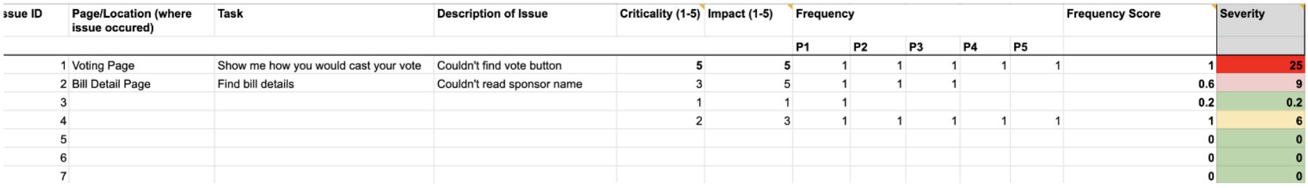
To perform this type of analysis, you’ll need to rate all of the tasks on three scales: (1) Task Criticality, (2) Frequency, and (3) Impact. Use this Google Spreadsheet to help you get a better sense of how to use the formulas!
-
Task Criticality: How important is the task in relation to the functionality of the app? For example, the ability to vote in an app that’s main purpose is voting would be a level 5 (very important).
-
5: Very Important/Critical
-
3: Important
-
2: Somewhat Important
-
1: Not Important
-
-
Frequency: How many times the issue occurred across all of your participants. For each participant that experienced the issue, add a tally of 1 for that issue.
-
Impact: Best explained in an article by Toptal, “Impact” refers to the level of interference the issue created in allowing the user to perform the task (rated from 1-5, with 1 being a suggestion from the user and 5 being a blocker that prevents them from completing the task).
All together, these three scales will allow you to calculate a severity rating or score, and that score will indicate how important it is to fix the issue in the UX design.
What to include in a usability testing report?
Now that you have all the information on how to analyze the results from your usability test, we need to dig into the next step: creating your usability testing report! There are several critical components of a usability testing report that will allow you to deliver a well-rounded account of everything that happened while running user tests. Remember, the more detail the better when reporting on the following categories:
1. Who you researched
Make sure you have a section at the beginning of your report that summarizes who participated in your research. This should include how many participants were from each of your user groups. Provide an overview of the tool(s) you used to conduct the tests and how long they were.
2. Highest priority issues
For the issues that were the most severe or were frequently repeated, make sure they are at the forefront of your report and easy to locate. Each issue should have corresponding solutions and design recommendations (see our tip about this below!).
3. Provide context
Provide as much detail as you can around the issue and the reason it occurred. Include screenshots, mark them up and emphasize specific areas on the screen where users really struggled. Only saying, “users couldn’t book an appointment”, won’t cut it! Instead, try to be more descriptive, like, “users thought the book appointment button was disabled because there wasn’t a lot of contrast between the button colour and the button text. As a result, they didn’t click the button and abandoned the book appointment window.”
4. Include proof
Proof is powerful! When you conduct any form of qualitative research (including usability tests) it’s crucial to include evidence in the forms of direct quotes, audio clips or video recordings of participants struggling with a task. There is something powerful about having stakeholders and team members watch a video of someone getting frustrated that will really drive home the point: this bad UX needs to be fixed! Again, use verbatim quotes whenever you can as proof to back up a point or even to show positive feedback.
5. Include positive findings or “kudos”
This is so important! It can be very easy to tear apart the design of an application after conducting usability tests. After all, one of the main reasons you are conducting those tests is to find flaws. However, you never want to lose sight of the fact that a team of people are behind that design (including UX designers, product managers, engineers, and senior executives) and they have worked hard to get it to where it is. Be mindful of who will read your report, and be sure to include positive feedback users mentioned and note the tasks that ran smoothly. This gives the team extra encouragement and lets them know they are doing great work!
6. Present design recommendations
In our opinion, a usability report isn’t very useful unless it includes recommendations on how to improve the UX design. Make sure you have a section in your report prior to wrapping up that enumerates possible design recommendations. If you aren’t sure how to come up with design recommendations, meet with the UX designer to review the usability issues (prior to finishing the report) and ask them to come up with a few suggestions that could be included in the report.
7. Include future research and next steps
We always like to include a section in our reports that list out future research opportunities and next steps. Usually, when you are doing any form of research (whether that be interviews or usability tests), you will always end up with more unanswered questions and ideas for areas that you’d like to explore further. By listing out future research activities, you are priming your managers or stakeholders to understand that research is never really done. You’ll get to gauge their appetite for doing more research and if you’re lucky, they’ll be on board with some of your ideas!
We hope this post on analyzing data and writing usability testing reports will help to improve your reporting skills! User testing can feel like a daunting process, from recruiting participants to testing, analyzing your findings, and creating a killer report. Tuck this blog post in your user testing toolkit so you can easily look back on our best practices, which key data points to collect, the best data analysis methods, and exactly what information should be included in your usability testing report!
Resources we like…
-
Mind the Product and Using Grounded Theory to Prioritize Product Features
-
NNGUX on Affinity Diagramming for Collaboratively Sorting UX Findings and Design Ideas
-
Hot Jar’s 12 templates and checklists to get you started with usability testing